
GoodRx Care
GoodRx Care is a consumer telemedicine platform offering a broad selection of affordably-priced healthcare services.
My role was to lead design for a new team focused on helping new patients successfully onboard and navigate their first visit.
Leveraging insights from user research and product analytics, we substantially reshaped the experience — yielding double-digit lift to visit completion and helping millions in need receive affordable treatment.
healthcare · telemedicine · User onboarding · product growth · behavioral desigNSmall Team, Big Mission
Our squad was lean — I was the sole designer, alongside a product manager and three engineers. Despite our size, we were responsible for a broad swath of the patient journey, including service selection, account registration, and patient intake.
This was a critical part of the journey.
Dropoff at any point ultimately meant that no consultation would be given, no revenue would be generated, and the patient would leave without receiving treatment for their health concerns.
Talking to Patients
From our analytics data, we knew where we were losing users in our funnel. But to understand why, we needed the patient perspective.
The user research practice at GoodRx was still nascent, and we had little in terms of initial learnings. But with the help of partners across the org, we built a research process from the ground-up that delivered valuable insights into our patients and their experiences with our service.
✅ Key Motivators
The core value proposition of GoodRx Care resonated strongly with patients, with several major advantages over in-person visits to the doctor’s office or healthcare clinic.
Affordability
The relatively low cost of our services was a huge draw. Our patients skewed lower-income, and commonly experienced gaps in health insurance coverage.
Convenience
Our patients appreciated the comfort and flexibility of virtual visits, citing the hassles typically associated with scheduling and attending medical appointments.
Immediacy
With the on-demand nature of virtual visits, our patients generally expected and hoped for a quick resolution to their health concerns.
⛔️ Key Concerns
At the same time, doubts and concerns were prevalent — often stemming from the novelty of virtual healthcare and GoodRx Care itself being relatively new to the market.
Legitimacy
Our patients expressed uncertainty in regards to the qualifications and experience of our healthcare providers — some went as far as assuming they’d be interacting with a bot, rather than real-life medical provider.
Privacy
Many patients spoke to a general apprehension around the privacy and security of their information that they were sharing during their visit.
Treatment
Throughout the visit, patients often had lingering questions around whether their specific medical needs could be addressed, the viability of receiving a prescription via telehealth, and how they would actually obtain any prescribed medications.
Trust & Clarity
From our research, it was apparent that trust and clarity were areas where we needed to improve. To help plan our approach, I facilitated a series of cross-functional brainstorms to generate a wide range of ideas. These sessions were often joined by our clinical staff and providers, who brought unique, on-the-ground perspectives.


OpportunityHow might we help patients move through their visit with greater confidence and clarity?
Stepping forward
We tackled this problem space with a targeted, incremental approach — utilizing research insights and analytics data to inform successive product experiments across the funnel.
In terms of tactical design, I often leveraged behavioral science concepts like reciprocity, goal-gradient effect, and operational transparency in my solutions to help build user trust and confidence.
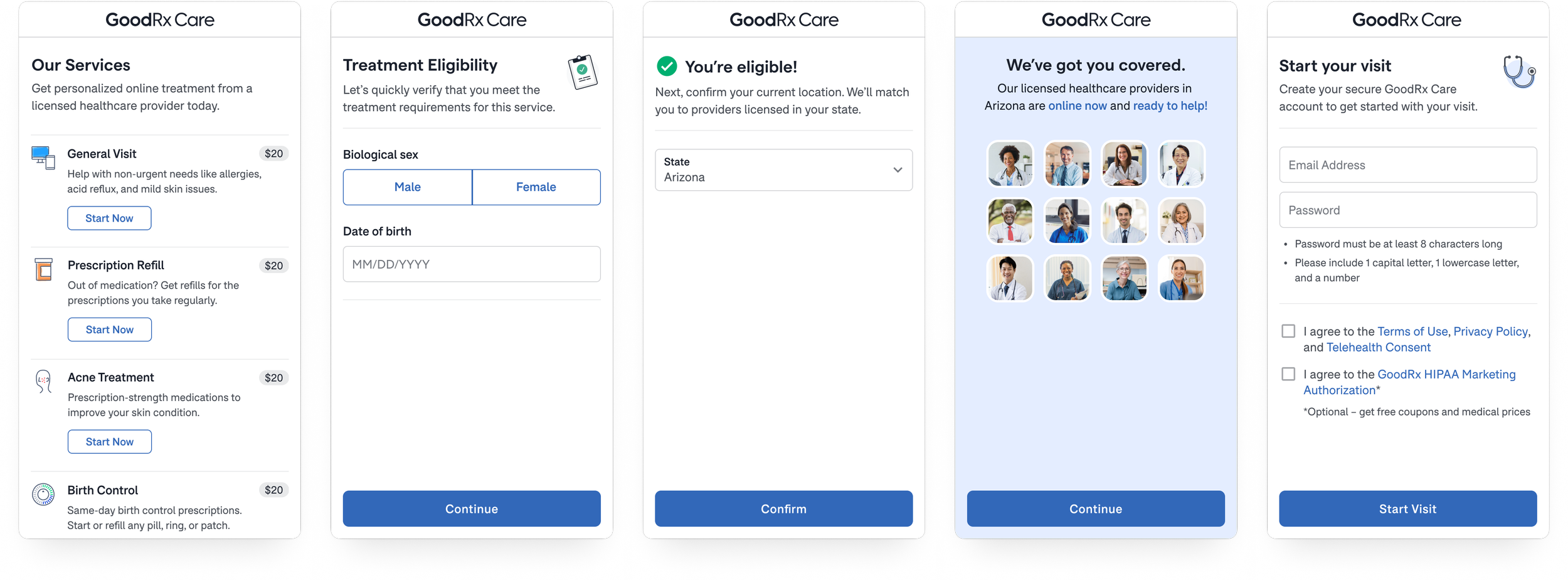
Registration
Registration is the first step of onboarding, where users select their specific healthcare service, create a user account, and answer legally-required questions to qualify their eligibility for treatment.
BeforeIn the original flow, patients were prompted to register immediately after selecting a service, with minimal context setting. Furthermore, when users didn’t meet the eligibility requirements, they would be immediately disqualified after creating an account — a very frustrating experience.

What changedWe reordered the steps in the flow to verify their eligibility before account creation, and adopted a more conversational approach that directly addressed primary concerns we heard during our research:
We affirm that their consultation will be conducted by a real-life healthcare provider, licensed in their state.
We explain to users why we need their sex, birthdate, and location; then promptly reciprocate and acknowledge their responses.
We clarify that providers are currently online, to reassure users that they wouldn’t hit a dead end as they proceeded through the visit.
Next Steps
Immediately following registration is the Next Steps screen, which served to help users understand what to expect during their visit.
beforeThe original design lacked key details, including the fact that identity verification and billing confirmation were prerequisites to consultation — this disconnect was a substantial source of user confusion and critical feedback.
Furthermore, once a patient continued past the Next Steps screen, there was very little feedback to help them understand how far along they were in the process, or how much further they had to go.

what changedTo better align expectations with the actual visit experience, we added a more detailed outline of the visit process, with specific descriptions of what took place at each step.

Visit progressAlongside the Next Steps updates, we introduced a new progress bar to help patients stay oriented as they moved forward in their visit. The milestones in the progress bar mapped directly to the outline from the Next Steps screen.

beforeIn general, both pages lacked important details and context to educate and motivate users to continue forward.
On the Photo Upload page, users were not clear on why they had to submit photos, who would have access to them, and what forms of ID we accepted.
On Review and Pay, there was confusion about what the visit fee was and what it included (many incorrectly assumed it covered the cost of medication). Users were also under false impression that they were being charged at this step, when payment was not actually processed until the very end of the visit.
Photos & Billing
These are the final two steps in Onboarding, where users submit photos to verify their identity and provide their payment details.

what changedWe renamed the page titles to more accurately reflect the intent and purpose of these steps. Photos became Identity Verification, while Review and Pay was changed to Billing.
On the Identity Verification page, we explained the purpose behind verification, added a privacy & security banner, and listed out accepted forms of ID.
On Billing, we called out our satisfaction guarantee and added a secure lock icon to the payment card field. We also explained what our visit fee covered and clarified that payment was not collected until the completion of the visit.

Revisiting the Visit
Thus far, most our efforts had been centered around optimizing the basic building blocks of the visit funnel. To push things even further, we came back to our user research — zeroing in on the key questions and concerns that patients had around the specifics of medications and obtaining their prescriptions.
Original visit flow
Originally, treatment preferences and fulfillment options (pickup vs delivery) weren’t presented or captured until the consultation stage at the end of the visit:

This meant patients were proceeding through their visit with lingering questions and concerns.
💊 Treatment options
What specific medication options are available?
🏪 Fulfillment process
How, where, and when can I get my medication?
💵 Price breakdown
How much will this all cost, what exactly am I paying for?
New visit flow
We hypothesized that if we preemptively addressed these questions and concerns upfront, it would help propel patients toward completing their visit.
To accomplish this, we explored the idea of flipping our visit flow on its head — using treatment preferences and fulfillment options as the new starting point, alongside an updated Billing Review page with improved pricing transparency.

A New Beginning
We kicked off the process of validating this new visit flow, starting with our highest-demand services. In terms of design considerations, while the general sequence of steps remained consistent, each service had unique nuances to account for.
Acne Treatment
For our Acne Treatment service, we gave users the ability to indicate their specific preferences around medication and dosage. With that, we also made sure to include a path forward for patients who were ambivalent or uncertain.
After treatment selection, the flow follows the same general pattern we established for this revamped flow — choosing between pharmacy pickup or home delivery, confirming the respective details, then reviewing billing details.

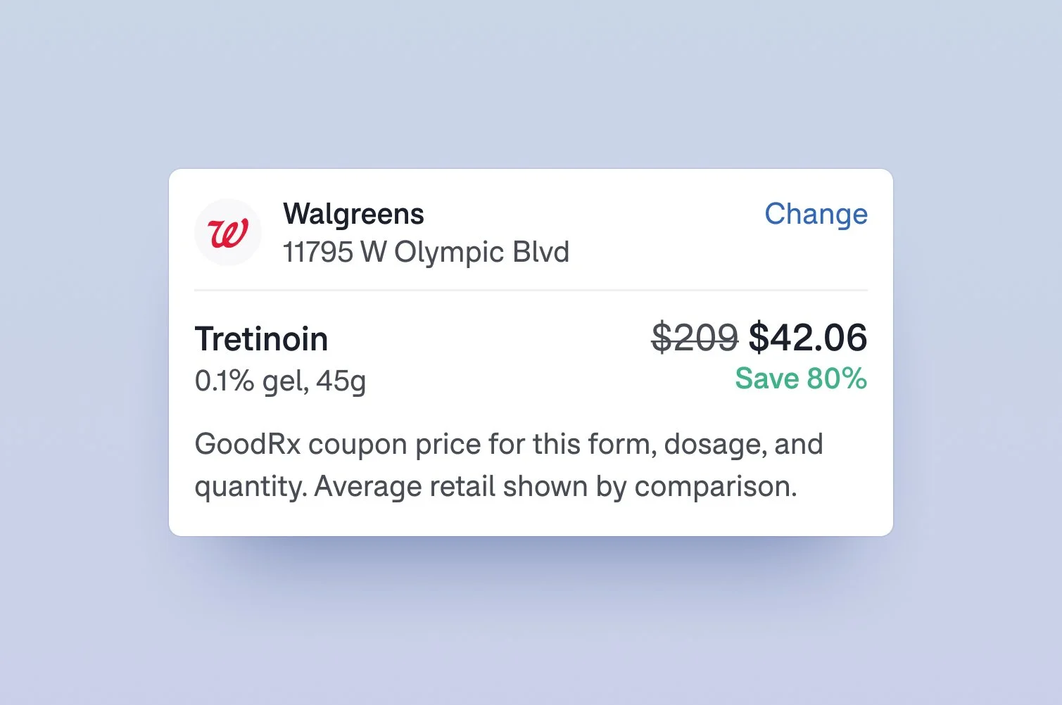
GoodRx Savings Card
Worth special mention is a new module at the the top of the updated Billing page, which served two important purposes:
First, it highlighted the substantial savings from the auto-applied GoodRx coupon — we found this to be a powerful motivator in itself.
Secondly, it clarified that the prescription itself was a separate cost, to be paid at the actual pharmacy.
Birth Control
The main design challenge for our Birth Control service was that contraceptives come in multiple forms, with literally hundreds of different brands and generics available for pills alone. We accommodated this by first asking users to select a form factor, then identify their specific preference via a predictive search experience.

Prescription Refills
This service was primarily used to refill medications for chronic illnesses. Despite this critical need, historically it was one of the lowest-performing in terms of visit completion, patient satisfaction, and refund requests.
Users had to go through a full visit to learn if their medication was refillable, which was especially frustrating when that was not the case. We addressed this by providing upfront indication of refillability via a contextual search experience.

Treatment transparency
With treatment questions and concerns addressed upfront, patients could proceed forward with greater confidence. This new approach proved to be highly effective, and was eventually adopted across all our services.
Our Impact
Through our collective efforts to improve the patient onboarding experience, our team drove substantial business impact. We saw significant conversion increases for the end-to-end visit funnel, plus a marked improvement in customer satisfaction for new patients.
increase in visit completion
With improvements across the entire visit funnel, we saw a greater percentage of new patients continue all the way to the very end of their consultation.
decrease in refund rate
New patients were now requesting refunds at a much lower frequency. This also meant our patient support team was spending less time fielding these requests.
increase in post-visit CSAT
The proportion of new patients who rated their visit as good or excellent also increased, a really positive signal for an improved patient experience.
Final Thoughts
For many people, getting treatment for health concerns is a complex, emotional, and deeply personal experience.
I think this speaks to why strengthening user trust within our product experience was so important. Ultimately, our patients were placing their health in our hands, so it was our responsibility to help them feel comfortable and confident throughout the process.
I’m super proud of the role my team played in helping millions of GoodRx Care patients get the help they needed.
more design goodness