
La Tarjeta Tala
La Tarjeta Tala is an integrated trio of products: debit card, deposit account, and banking app, tailored to the unique needs of the financially underserved in Mexico.
This was was a true zero-to-one initiative. My small, pioneering team traversed the entire product development lifecycle — assessing the opportunity space, conducting mixed-methods research, formulating a product strategy, then finally designing and shipping the full experience.
Fintech · mobile banking · debit card · zero-to-one · Mixed-methods research · emerging marketsTala Mission & Vision
Tala builds financial services for the world’s emerging middle class, a cohort of billions whose needs have been overlooked and underserved by traditional banking institutions.
Tala broke ground in Kenya, when in 2011 it introduced a convenient and affordable solution for a widespread problem — people who needed access to credit, but were excluded from the formal financial system.
With the Tala Android app, borrowers could instantly apply for, receive, and repay loans without the barriers of collateral or a formal credit history.
Following its success in Kenya, Tala has since expanded into multiple countries, with nearly 4 billion USD in loans disbursed to over 8 million worldwide customers.
But lending was only step one in Tala’s long-term vision. Ultimately Tala aspired to be the all-in-one banking solution for the financially underserved across the globe.

Forging Ahead
The next stage of Tala’s vision centered around the Tala Account — a mobile-banking product with a full suite of financial services.
Our first big team decision was determining where to launch and incubate Tala’s inaugural Account product. As we weighed our options, Mexico emerged as an ideal venue.
Mexico was already one of our key growth markets, and was distinguished by a substantial unbanked population — which at that time was 65% of the adult population (nearly 43 million people in total).
With little to no access to institutional financial services, this cohort often resorted to informal solutions to manage their money. Common examples included relying exclusively on cash to save and transact, and forming peer-groups (known as tandas) to pool funds for credit and savings.
Customer Research
Our next step was to speak directly with our customers in Mexico to better understand their financial lives and assess where a Tala Account might fit in.
I collaborated closely with my UX research partner and in-country teams to plan and carry out our research. We employed multiple methods in our approach, including interviews, shadowing, diary studies, and surveys.

Some of the wonderful customers we met with.
Key Themes
Our research helped us get a fuller picture of our customers’ financial lives — general attitudes and sentiments, needs and pain points, and the finer details around how they conducted financial transactions from day-to-day.
🏦 Traditional banking didn’t fit
Bank accounts often came with onerous conditions that clashed with the financial realities of our customers. Many of our customers had tried opening bank accounts before and were denied multiple times over, or had previously held accounts and needed to close them after becoming overwhelmed with fees and restrictions.
⚠️ Cash came with safety risks
The fact that our customers financial lives revolved around cash put them at substantial risk for theft. Nearly every customer we interviewed shared multiple stories of being pickpocketed or mugged. This was a constant source of anxiety and and trying different strategies to try and avoid it from happening again.
🛑 Financial friction was pervasive
Performing everyday transactions was often labor and time intensive. One of the most egregious examples was paying bills — our customers regularly spent hours just to pay their monthly services in person. Furthermore, digital solutions were generally scarce, unreliable, and suffered from a poor UX.

OpportunityOur research strengthened our conviction on Mexico. We saw optimal conditions for robust product growth — a large addressable market with deeply unmet financial needs, coupled with clearly-defined set of use cases to expand into.
Product Definition
With our customers’ needs and pain points in mind, we began the process of defining the core product. One of our main considerations was how each feature would contribute to adoption and ongoing usage.
As our value proposition took shape, we regularly looped in customers to help inform our decisions and keep us grounded. We employed a variety of feedback techniques, including prototypes, landing page concepts, and card sorting exercises.


Mobile App Experience
The Tala Account app was designed around three principal tenets: simplicity, speed, and scalability.
Simplicity
We aimed for a straightforward and streamlined user experience, with a flat hub-and-spoke navigation model, a minimalistic user interface, and concise copy.
This approach also helped ensure the designs could size down gracefully on the smaller-screen devices that were common to our customers.
Speed
Core functionality was placed front-and-center for quick and easy access. Tasks were designed to be completed with a minimal number of steps, and followed the same general pattern for predicability and learnability.
Scalability
The UI itself was highly modular, making ample use of reusable layouts and components. Beyond the technical advantages of this approach, we were also laying the groundwork for a platform that could readily adapted for our other markets.
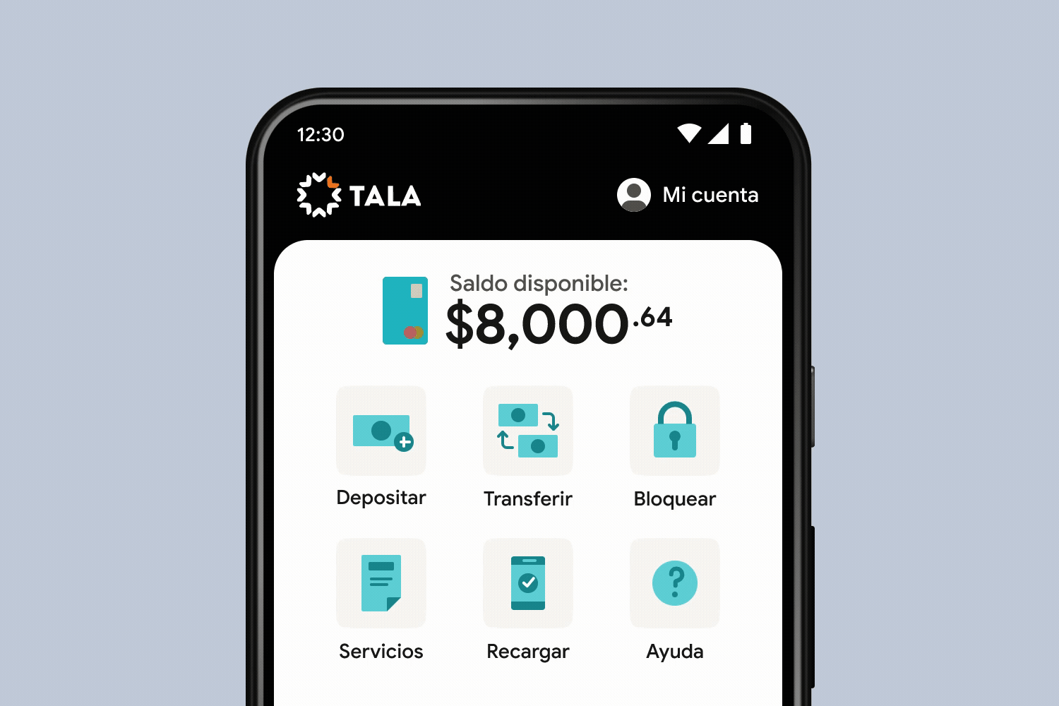
Tarjeta Tala Home
As the central hub of the app, the homescreen features a launchpad of banking services, alongside key account information like the available balance and recent activity.

Core Functionality
Tapping on a service from Home initiates the corresponding transaction flow. Each flow was standardized around a five-step sequence, utilizing the UX design principle of staged disclosure.

Cash deposits
Without physical bank branches, we needed a creative solution for accepting cash deposits. We ended up integrating with a network of popular stores and retail chains (where our customers already frequented) that facilitated cash deposits via an individualized barcode presented to the cashier.

Mobile top-ups
Our customers primarily purchased mobile airtime and data on an ad-hoc basis (as opposed to a monthly plan). Our customers relied heavily on their phones, so this was an activity that was performed frequently.

Bill payments
Our users often paid their bills in-person, using cash. These experiences tended to be tedious and inconvenient — sometimes with multiple hours spent on transportation, waiting in line, and dealing with customer service. Paying bills with a mobile app could be a huge timesaver.

Bank transfers
Transferring funds to external bank accounts addressed a common need. Many of our customers ran storefronts, and purchasing inventory would often entail traveling to vendors with large sums of cash. Another prevalent use case for transfers was domestic remittances — sending money to loved ones elsewhere in Mexico.
Card disabling
This digital toggle temporarily disabled the debit card with a single tap. Card fraud was pervasive, and some form of this feature was standard in nearly every banking app. Anecdotally, customers also mentioned the toggle could be used to manage spending (another common struggle).

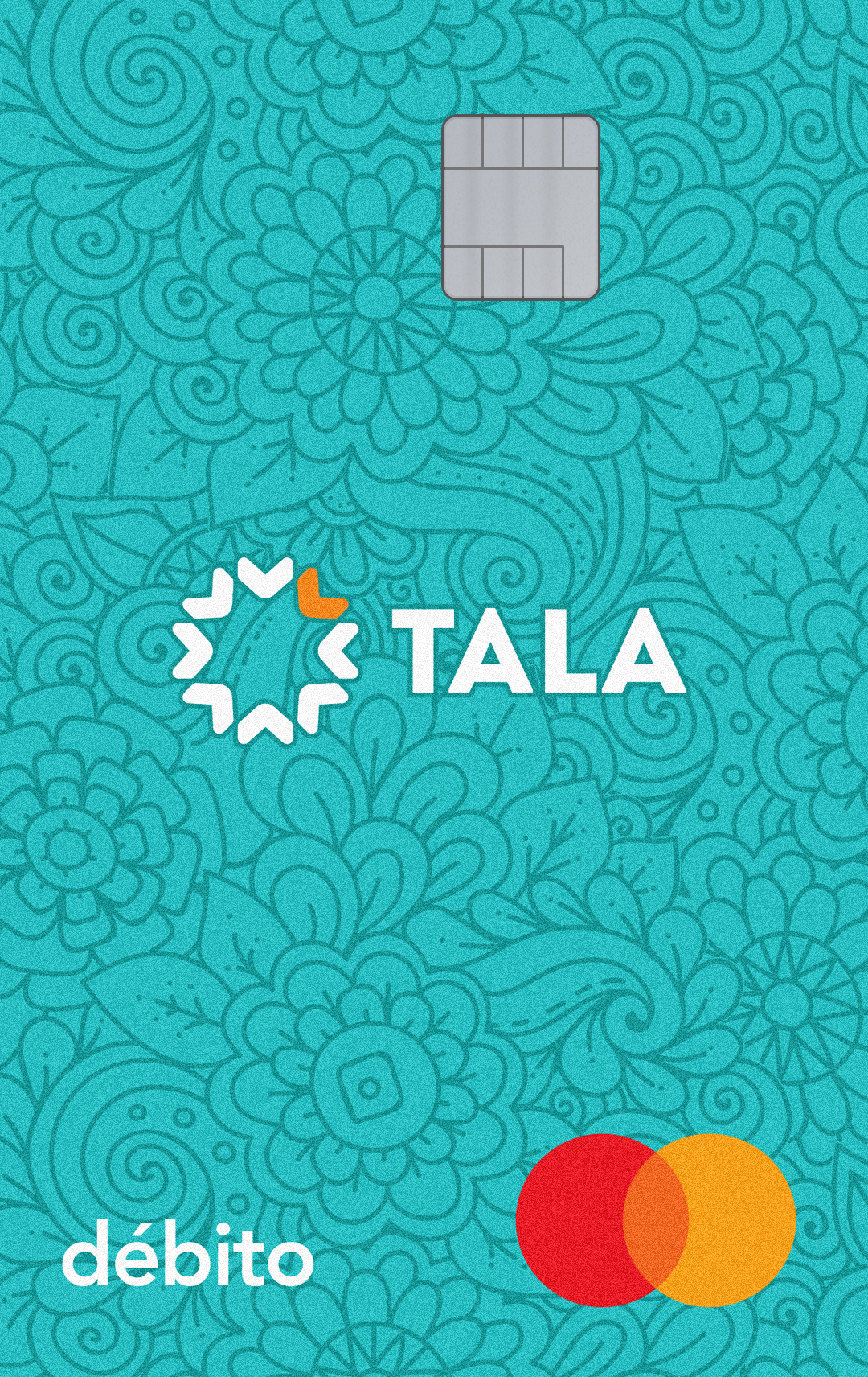
Crafting the Card
In parallel, I was also leading the design process for the debit card itself. The goal was to be appealing and approachable while capturing the distinctive character of the Tala brand.
As we explored different creative directions for the Tala card, we brought customers in to get their feedback — they were eager to weigh in!

Learning on the job
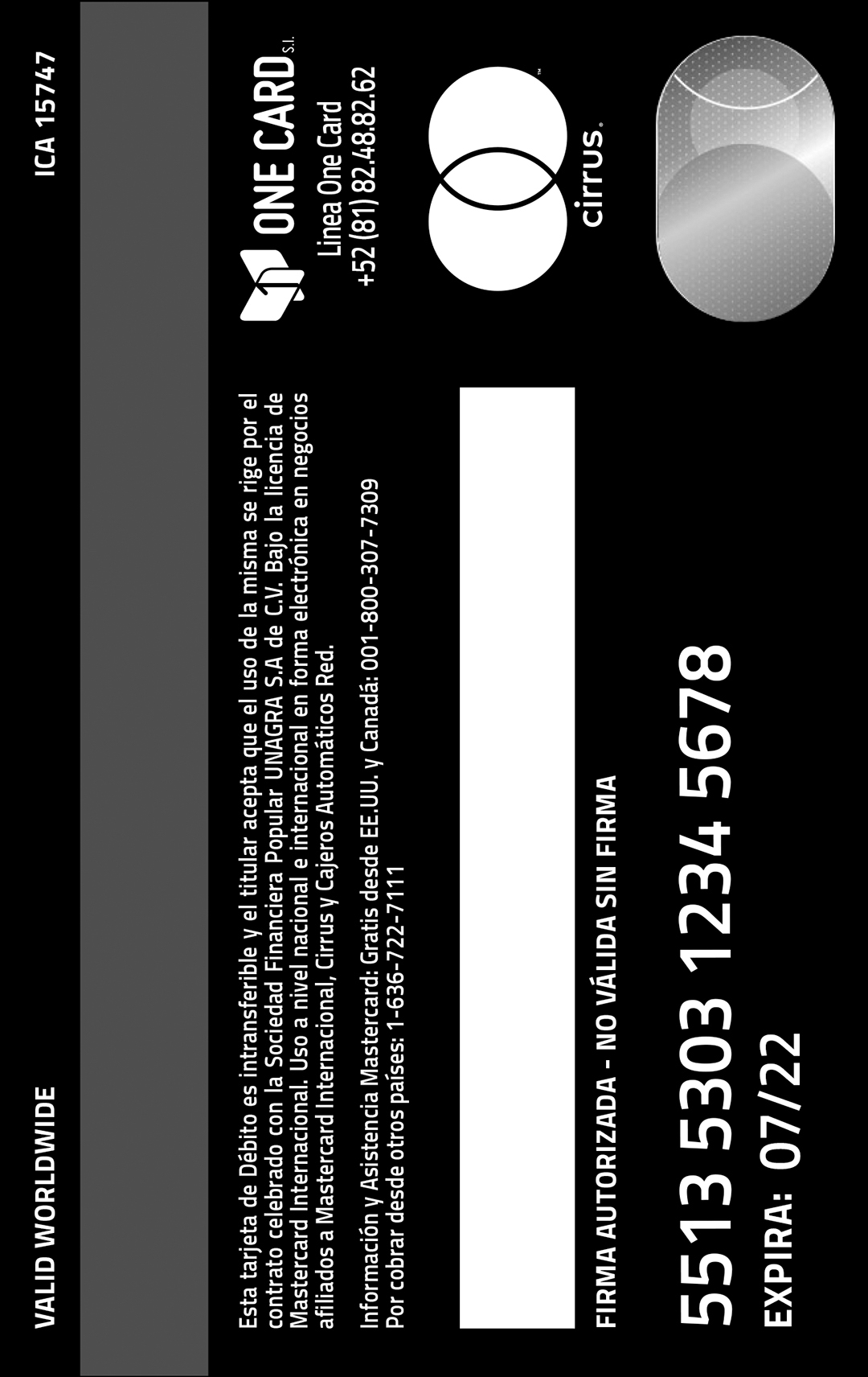
Beyond the design of the card, there was also a lot to learn and do on the production side — including familiarizing myself with Mastercard’s extensive guidelines, getting final sign-off from Mastercard itself, and understanding the inner workings of the manufacturing process.
On top of that, the card was being produced in Mexico, with multiple streams of communication and tasks to coordinate.


Launch Day
The weeks leading up to launch were an all-out push to the finish line, but we were finally ready to introduce Tarjeta Tala to the world. We delivered the first batch of cards to customers, alongside our brand new mobile app. Our customers were soon using Tarjeta Tala to save, spend, and send!
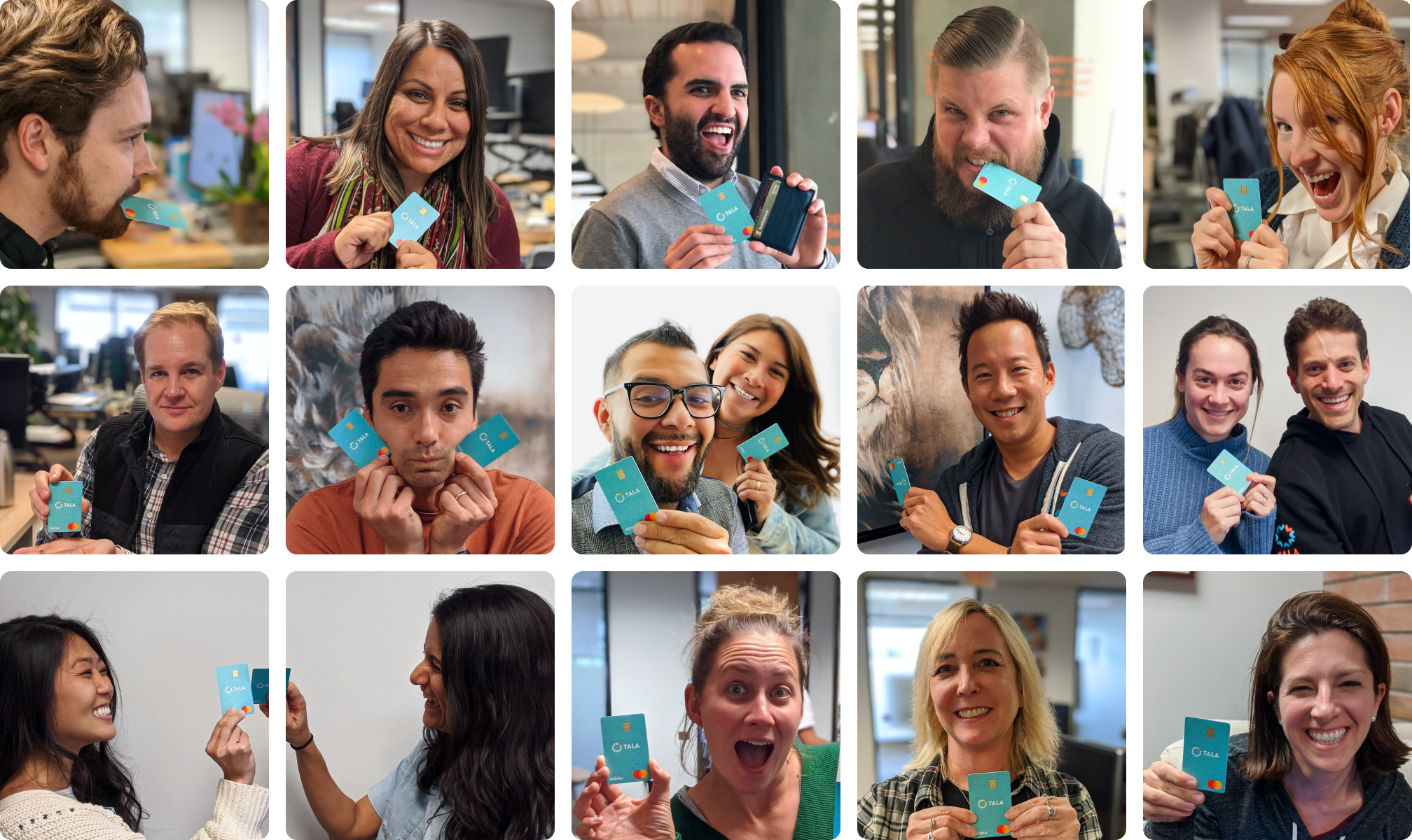
The Tarjeta Tala team, along with some friends and fans :)
Customer Reception
Post-launch, our customers were excited to share their experience. The overall response was encouraging and customers were delighted have a product built with their unique needs in mind.
They were especially pleased with the ease-of-use of the app and the visual design of the card itself, which was a nice testament to our efforts to keep users closely involved throughout the process.
Final Thoughts
La Tarjeta Tala was an incredible team effort, and I couldn’t be prouder of the end result. We delivered genuine utility and value to our customers with a convenient, secure solution for their everyday financial needs.
We launched the first non-credit product in Tala company history, completing a huge milestone toward our vision of becoming an all-in-one financial services provider to the globally underserved.
And finally, this project drove a tremendous amount of personal growth for me. Being involved with nearly every facet of the process pushed me in new directions across research, strategy, and design.
Tarjeta Tala being used for the very first time!
more design goodness