
Hulu Android Redesign
With the introduction of Google's Material Design framework, there was finally an official set of standards to guide the design and development of a best-in-class Android app.
At Hulu, we seized this opportunity to kick off a long-overdue redesign of our own Android experience. I spearheaded this design-led effort, which included defining the application of Material Design, improving core screens and flows, and partnering across the organization to establish content priorities and requirements.
Android · material design · UI Animation · redesign · advanced prototyping · streaming VIDEORethinking Home
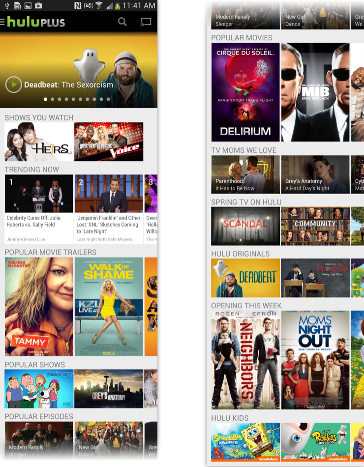
Home is the main vehicle for discovery in the app, and the first screen to load on launch.
In the original design, the layout was essentially a condensed version of the web homepage, with rows of scrollable "trays" stacked on top of one another.
Analytics indicated that scroll depth down the page and within the trays was quite shallow. We suspected this was largely due to how the page was designed — specifically, there were three areas where we were falling short
The concurrent display of so many choices was overwhelming, leading to decision fatigue.
Content wasn't meaningfully organized, making it unclear on how to effectively navigate the space.
The show artwork and video thumbnails alone failed to provide enough context to motivate user action.
1.
2.
3.
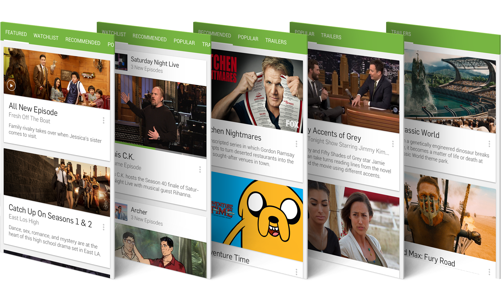
This allowed for a more focused and predictable browsing experience, and provided users with consistent anchors to pivot between different types of content.
Working with the Content, Editorial, and Marketing teams, we established five top-level categories: Featured, Watchlist, Recommended, Popular, and Trailers.
Picking up the Tab
I started with the first two issues — the overwhelming amount of options and the unclear organization. I proposed the idea of defining discrete categories that all our Home content could be mapped to, paired with a tab bar at the top of the page.
From Tiles to Cards
Having thought through how we would be organizing content, the next piece of the puzzle to solve was presentation.
Tile Limitations
Historically, content on Hulu was represented via rectangular boxes we called tiles. Tiles would often feature show art or utilize still shots from video.
While tiles worked great as modular building blocks, their static form factor limited their ability to provide additional context or functionality.
Because of this limitation, users would often find themselves having to tap multiple times and visit multiple screens to get information about a show or take action on a piece of content.

Standard tile lockup from the Hulu homepage
Card Capabilities
We ended up with a simple, but effective solution — extending our Tiles into full-size Cards. Cards were already a core Material Design component, and came with a number of built-in benefits:
✅ Designated area to surface additional content details
✅ Contextual menu for useful actions, such as saving to watch later
✅ Ability to expand and contract based on different content needs

Section by Section
Though the card component would be shared across all of Home, each section had unique content needs. To ensure our proposed solution would scale, I stress-tested the design in every section.

Featured
The Featured section consists of promoted content and editorial collections. For the editorial collections in particular, we introduced the concept of themed playlist cards. The Hulu editorial team invests significant time into curating video collections, and we hoped to inspire more watching with the new presentation format.

Popular
The popular category brings together the numerous trending and popular collections. With an emphasis on short-form content, it tends toward highlights from talk shows and reality TV.

Recommended
The Recommended category benefited immensely from the card format. Layering in the synopsis helps explain the show's premise, and the contextual menu provides several useful shortcuts, including removing a recommendation to further personalize your experience.

Trailers
For movie trailers, we pushed forward the idea of using video thumbnails in place of posters. This keeps the card design consistent, aligns more closely with the video content of the trailer, and indicates new trailer availability more effectively than static poster art.

With its additional functionality, the Watchlist cards had some unique considerations that needed to be addressed.
New Watchlist
To resolve this, the new Watchlist card shifts the emphasis from the show to the episode. Now, tapping the card initiates video playback of the episode, making it easy for users to pick up where they left off.
The Show Page is still easily accessible via the show bar, which sits right above the video thumbnail. Also worth noting is the addition of an episode progress bar, which informs users what portion of an episode they've already watched.
Watchlist
Watchlist Interaction
Watchlist keeps track of the shows users are actively watching or have saved for later. Its most common use case is to resume an episode or watch the following episode in the series.
However, to actually play a Watchlist video, the user has to maneuver through the Show Page first. Oftentimes this creates an extraneous step, since the Show Page offers little value if you're already watching the show.

Show Page
The Show Page serves as the primary hub for a given television series. In addition to housing video content — episodes, clips, and trailers, it also provides key details like the synopsis, user ratings, and production info.
New design
In rethinking the design, our first change was to incorporate the show details into the Show Page.
Next, we dropped the horizontal trays for a more easily-scrollable list layout, and reorganized the page into clearly defined sections. The Watchlist and sharing functionality, which were buried in the original design, were added as discrete actions in the Action Bar.
Original design
As with the Home Screen, the original design of the Show Page mirrored the website — show artwork, followed by a series of trays.
In the original design, details such as the synopsis, user rating, and genre were located on separate page. Given that one of the main purposes of the Show Page is to introduce new shows to users, this was less than optimal.


Video Playback
Original design
In the original interaction model, tapping a video thumbnail in the app would take the user to the Video Detail page first, rather than to the video player. While this page offers some potentially useful information, it mainly adds friction to the experience.

As a central component of the Hulu experience, the video playback experience was something we looked to improve on as well.

New design
We changed this logic so that tapping a video thumbnail would launch directly into the video player. Video details would still be available on the paused state of the video, if users wanted to access them.
We also made refinements to the player interface itself for a more streamlined, visually-balanced layout. Contextual actions were moved to the Action Bar, with commonly used controls (Chromecast, close-captioning) exposed and ancillary functions nested under the overflow menu.
Original Design
New DesignPrototyping
One of my favorite parts of this project was bringing the designs to life through prototyping out the end-to-end experience.
I was particularly excited to explore the idea of meaningful motion. Meaningful motion is a core tenet of Material Design, wherein transitions, animations, micro-interactions are used to stitch together the experience and aid in user understanding.
The prototypes I created were also instrumental in helping me and our stakeholders see how the entire experience fit together, in addition to serving as a vehicle for getting feedback from users.
Final Thoughts
Redesigning the Hulu Android app was an extremely rewarding project. In the end, we delivered a substantially improved user experience that united Material Design’s core principles with Hulu’s distinctive visual brand.
For me, this was also a great opportunity to jump back into designing for Android. I’m excited to see how Material Design continues to evolve, and look forward to future opportunities to explore its full potential.
more design goodness